The Symbolic Meaning Behind the GCCST Logo
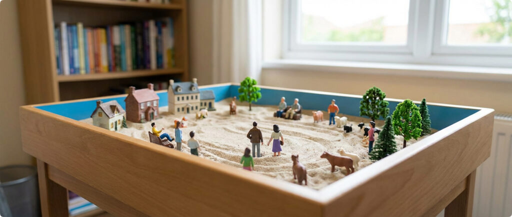
Sandtray therapy is a projective technique using a tray of sand and miniature objects to create a three dimensional world. It is a non verbal, hands on therapeutic approach that allows adults, adolescents and children, to tap into the conscious and unconscious mind through symbolic representation.
Much care and consideration went into creating the logo for Global Council for Clinical Sandtray Therapy™ (GCCST). When we approached Laura Kayata, owner and creative director for SPARK creative services, she was unfamiliar with sandtray therapy. She visited the office of Sheri Shulenberger for inspiration and understanding about the symbolic therapeutic approach to mental health.
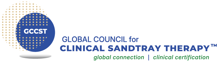
In marketing terms, the icon, company name and tagline represent the anatomy of a logo. Through our collaboration, the abstract icon was developed to represent the sandtray as well as the global community. Elements from real sand are represented by using beige color for grains, gradients, and drifts. The blue color was used for the representation of the bottom and sides of an actual sandtray which provide the symbolic element of water or the sky. The round disks create a perception of the globe. When all the components are put together, the GCCST icon was born.
The third integral color added to the logo is green, symbolic for growth and nature used for our
tagline, global connection | clinical certification. Our tagline represents the commitment we have for worldwide connection through the modality of sandtray and the importance of being grounded with Foundational and Advanced sandtray training which leads to becoming a Certified Clinical Sandtray Therapist™.
The complete logo formed when we added our name, Global Council for Clinical Sandtray Therapy™.